Landing pages for eBooks and Whitepapers should give visitors what they expect – a simple place to enter their information in return for your content. To do that, all that’s needed is 6 essential elements: headline, image, form, whats-in-it-for-them, trust indicators, and a post-conversion page. Keep the page simple and you should have a solid conversion rate.
Single Call-to-Action
A landing page for an eBook or Whitepaper has a single goal: entice a visitor to fill out the form and click submit. That’s it. No more. No less. If you are asking a visitor to do more than that or present more than that single option, your page will not be effective. Period.
This is one of the biggest flaws I see: landing pages with too many calls-to-action and too many navigation options. My biggest pet peeve is seeing the full navigation menu at the top of a landing page. Why would you make it so easy for your visitor to get distracted and NOT fill in your form? Get rid of it. Just have your logo which redirects them to your homepage.
Think about it, you’ve just clicked the “Get eBook” button from an email or display ad, and you arrive at the landing page. At this point, what do you want to do? Explore case studies? Sign up for a demo? See what products the company offers? Read a press release? NO NO NO. You just want to download the eBook and get on with your day.
Having the navigation menu at the top of a landing page is wishful thinking – that your visitor will be so enthralled by your landing page that they will take more time to explore your website.
Give Visitors What They Expect
Visually, your landing page should be exactly what visitors expect when they are looking for an eBook. The page should have:
- A compelling headline that matches how you described the eBook in your email, ad or social post
- A nice image of the eBook’s cover
- A simple form to fill out
- Short copy about the eBook – aka what’s in it for them?
- Trust indicators to help you establish credibility
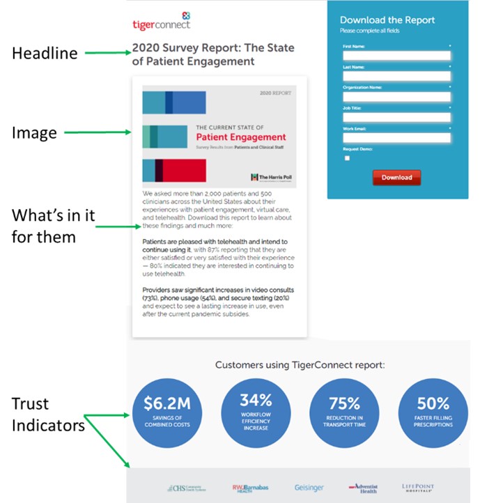
Here is a great example from TigerConnect:
Headline
The headline should be big and bold. It’s the first thing visitors should read when they arrive on the landing page.
A compelling headline is great, but it doesn’t have to be. Remember that your visitor has already clicked on your email, ad or social post to arrive here so you’ve already done a lot of the hard work. Now it’s all about filling out the form. Because of that, as long as your headline matches either the title of the eBook or the way you promoted it, you’ll be fine.
Pro tip: Keep it short. No more than 10 words
Image
An image of the eBook’s cover should be prominently displayed above the fold on the landing page. It can be a flat image or a fancy 3D rendering of the eBook or whitepaper. It should match the actual cover.
Pro tip: A cover with a solid colored background stands out more than a cover with a photograph
Form
This is the most important element of the landing page. It is the singular call-to-action. To help the form stand out, consider putting a different colored background or putting a border around it. Also, make sure the button is large and a bold color.
Pro tip: Only ask for the fields you truly need and consider a simple captcha to reduce bot entries.
What’s in it for Them?
The text on the landing page should answer the question: what’s in it for them?
One option is to clearly outline what a person will learn from your content (ie: Learn the 5 traps to avoid when building a marketing plan). Another option is to outline the follow-on benefits of reading your content (ie: After reading this eBook you will know how to construct your own engaging patient newsletter).
Pro tip: use bullet points (max 5)
Trust Indicators
Some visitors may not be familiar with your brand, so it is important to give them “social proof” of your credibility. This can be done by placing trust indicators on your landing page. These could be:
- Logos of customers, partners, funders or supporters
- Quotes from customers
- Quotes from others who have read your content
- Certifications that you have earned
Pro tip: do not use a scrolling image panel – these don’t work well on mobile devices
Post Conversion Page
One of the most forgotten elements is the post-conversion page…the page that appears AFTER a visitor has filled out a form and clicked the button to submit it. Usually it is just a bland page with a simple message like “Thank you, the eBook you want is on it’s way to your email.” Use this post-conversion page to do more than say “thank you”.
Consider offering your visitor one of the following:
<
- A video to watch
- Other resources similar to the one they downloaded
- A “next step” resource that draws them deeper
- An opportunity to book a demo
- A way to talk to your sales team
My preference is to offer two ungated pieces of content. Why? Because the post-conversion page is a rare opportunity to test which piece is more engaging. Keep in mind that you know who this visitor is (they filled out the form), so now you can test to see which pieces are better for which titles/roles.
Summary
Landing pages for gated content like eBooks, Whitepapers, and On-demand Webinars should be simple and uncluttered. The only goal is to get visitors to fill out the form, there should not be other options or distractions. Above all, don’t forget to leverage the post-conversion page to offer your visitors more ways to connect with you.


Add Comment